I think every photographer I’ve met can name the photographer whose body of work they followed and who eventually inspired them to pick up a camera. For me, it was none other than Dina Douglass of Andrena Photography. I find her images not just breathtakingly beautiful but also visually powerful. I would find myself coming back to some of the same images in her blog and found myself wondering what kept drawing me back. I’ve followed her work for so long and so closely that at one point I found I could identify one of her photographs without needing to see the credit. This may also be because Dina has a very strong brand and a very strong personal style. Her images are one of a kind.
I have always loved cameras but my family always had a point and shoot and for sure I didn’t have a family history of photographers. I just was obsessed from a young age to capture what I keenly felt were fleeting moments in our lives. As much as I wanted to take classes, I couldn’t. At that point in my life, time and money were in short supply and I was very focused on getting into a good university. Once I began working, my first big purchase, even before I replaced my one-foot-in-the-grave-clunky-hooptie ’87 Toyota hatchback kindly known as Stan, I bought myself a DSLR. Months before that I had been regularly visiting Dina’s blog to get my daily photo fix. Eventually it reignited my desire to learn photography.
Over the past few years I’ve actually come to know Dina as a real person. I have shadowed her, taken her workshop, and assisted a couple of times. Each time, I found myself learning something new. No doubt, Dina is an expert in her field and more than anything else what people notice and comment on most is her use and treatment of color. I mean, she is absolutely phenomenal in the way that she finds ways to creatively incorporate color in her images and then truly enhances them through her post production work. It is the first thing that you notice in her images and it is the most striking. Not only is she one of the most published photographers I’ve known, last year, Dina was also distinguished as one of top ten wedding photographers in the world by American Photo. She has also taught how she uses and treats color at WPPI as a Master class.
With all those accolades under her belt, can you image my sheer-fall-out-of-my-chair-from-excitement when I discovered she had designed and was releasing her actions, ColorPop?! Dina literally spent over a year painstakingly creating these actions to emulate and recreate her brilliant color work. I remember seeing her demonstrate these actions live at her booth at WPPI this year. Each time she went through an action and showed her before and after, the spectator would just drop their jaw in amazement.
I actually do not use actions very often and use them sparingly. I tend to create my own actions based on my workflow, except for a couple of awesome ones from the Kevin Kubota sets. But I am totally in love with the ColorPop actions. I find myself using them quite often and love seeing how dramatically my photographs are improved. I like doing the before and after snapshots then toggling between them 🙂 My way of patting myself on the back, I guess.
Below I’ve posted a few examples of before and afters that I did with the ColorPop Actions but you more information on the product site: https://www.colorpop.com/
I would actually also suggest looking through the information at https://www.colorpop.com/?cat=10 where Dina breaks down each and every action and some pointers on how to get your desired results.
Anyways, go check out Dina’s work if you have been hiding under a rock and haven’t yet. Then you’ll see why you should invest in adding ColorPop to your workflow.
BEFORE AND JAW DROPPING AFTERS
One of my all time favorite techniques is to use Double Down and then Red Candy (one of Dina’s suggestion on the ColorPop site):
Before:

After:

Another example of Double Down + Red Candy:
Before:

After Double Down only:

After Double Down and Red Candy

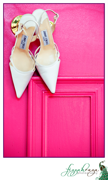
Who does not love hot pink? Lurk Punk really brought out the depth in this image that was kind of flat before:
Before:

After:

Before using Red Pop and Iggy:

After using Red Pop and Iggy:

The action set also has a set of toning actions…my favorites are the chocolatey black and whites but if you love vintage, I’ve included an example of that as well:
Before:

After using Vogue BW:

Same original image but using Miriam BW instead:

Same original image but using Vintage Vandal instead:

Fizzah, you are such a love for writing this totally unexpected and crazy post. I’ve been out all day, and it’s 3 a.m. and I only just now had a chance to check my FB to see your link. I adore you so much, and wish you lived closer. I adore these images and how you’ve used the actions, so thank you for posting them. But more importantly, thank you for your heart, and your kindness in writing such a nice post out of the blue. I’m blessed to know you. 🙂